Co-Creative Director and Brand Design
Sightings—Kapi‘olani Community College New Media Arts Student Show 2020
Co-Creative Director with Emily FreemanThe first virtual portfolio show
The graduating class of the New Media Arts Program at Kapi‘olani Community College needs a new website for its online identity to showcase student work and market its show during the beginning of the COVID-19 lockdown.
View WebsiteSkills
- Theme Development
- Art Direction
- Illustration
- Social Media Design
- User Interface Design
- User Experience Design
- HTML
- CSS
- Javascript
the challenge
Represent the cohort while bringing in the crowd
Construct a theme for the collective identity of the graduating Animation and Interface Design students. This will be the theme for the coded website that showcases their work and links to the virtual portfolio shows. Lastly, market the show to professionals and the public.
the outcome
Togetherness during a time of isolation
The students created the theme—cryptids—by capturing the spirit of both the Interface Design and Animation cohorts. To enhance the website graphics, students created illustrations to showcase the diverse nature of our cohorts. The combined efforts of students and faculty resulted in a custom-coded class website, promotional social media posts, and virtual event platforms to host the shows.
New Media Arts Student Show
The New Media Arts program at Kapi‘olani Community College celebrates its graduating class by displaying the final works from the Interface Design and Animation cohorts—specifically catered to professionals in the creative field.
Usually an in-person event, the onset of COVID-19 brought on the challenge of finding alternate means and virtual event platforms to host the shows. Students and faculty worked together to coordinate their works on Hopin and Zoom. Students fundraised the money for the show, which was headed by the student President—Tomy Takemura.
Theme Development
theme
Sightings
brainstorm
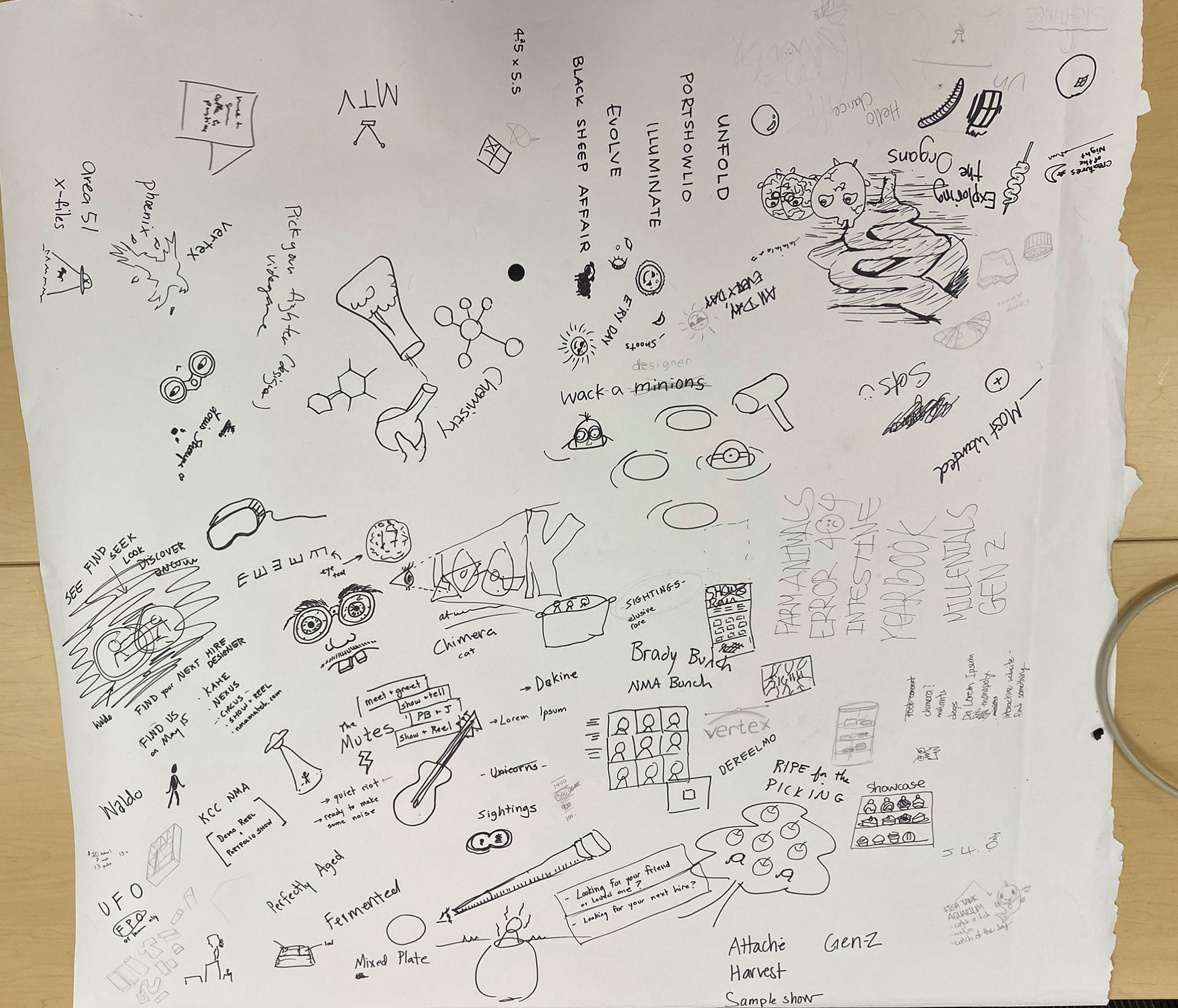
The Animation and Interface Design cohorts explored themes revolving around diversity, our various skillsets, and the transition to virtual classes due to COVID-19. As a result, we decided to revolve our theme—Sightings—around cryptids for two main reasons.
As creatives, we all have diverse and unique styles and specialties. We also enjoy exploring and pushing the boundaries of our abilities to discover new ideas and skillsets in ourselves and each other. We represented these aspects through the unique mystical and multifaceted quality of cryptids.
In addition, the newly implemented class regulations were challenging—at first—to stay connected. However, our cohorts persevered and we managed to find and stay connected. We decided to be inspired by this transitory period by reflecting it in the mystical, yet elusive quality found in all cryptids.
Design System
This is my h1
This is my h2
This is my h3
This is my H4
This is my body copy written in Open Sans. This font was used to describe the finer details of our show. The body copy on the website is written in white to contrast against the dark background, which varied along the spectrum of the gradient shown in the color study.
Color Study
logo Design

Emily Freeman and I decided to create a logotype that captures our bold and creative spirit. As a result, we chose Open Sans Condensed and Cormorant Garamond, which also compliments the intricate illustrations on the website.
Artwork
Illustrations
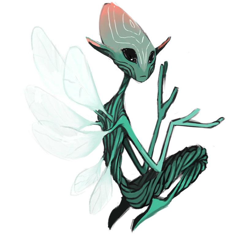
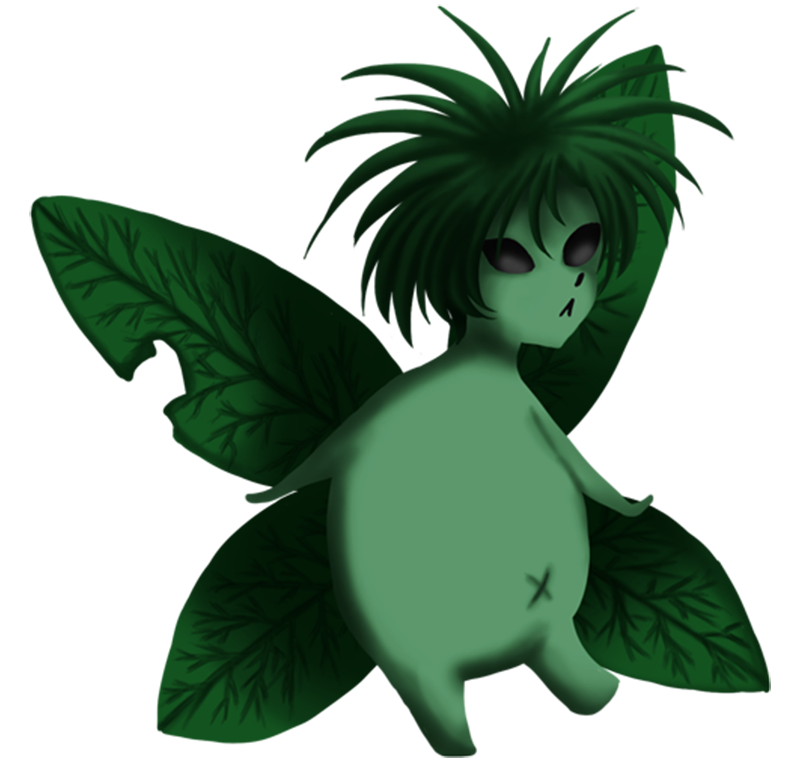
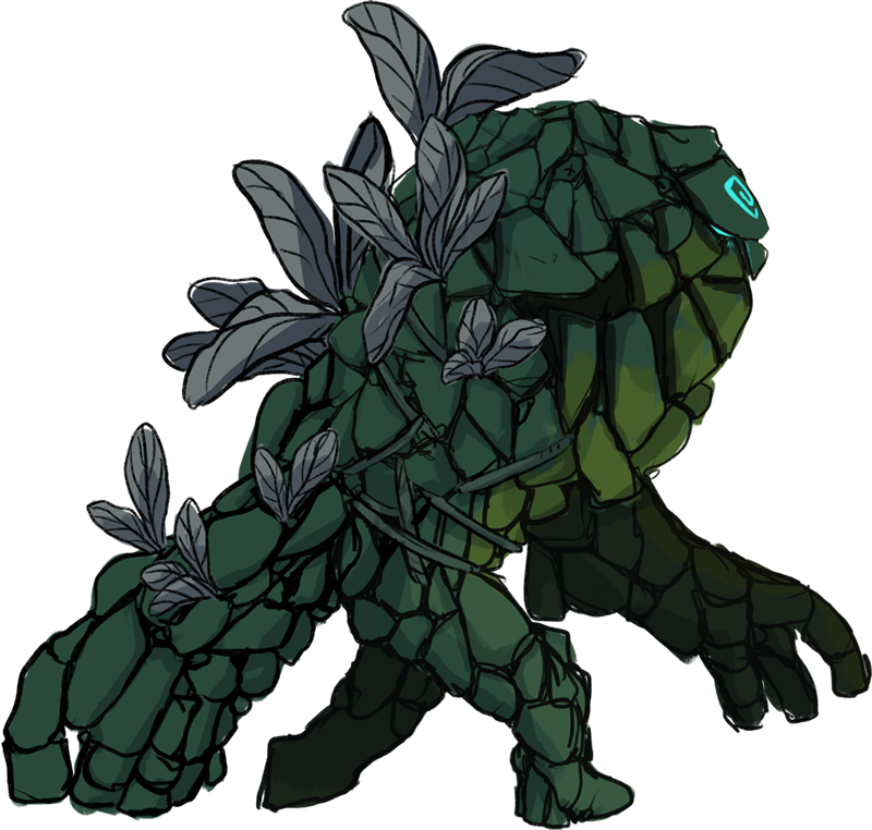
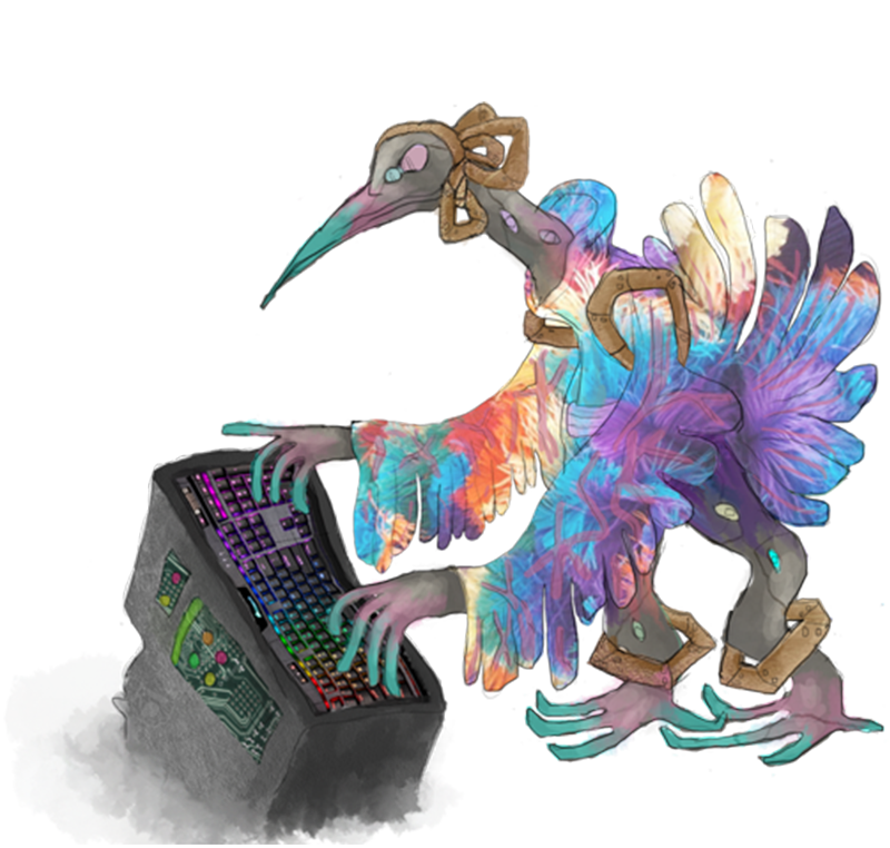
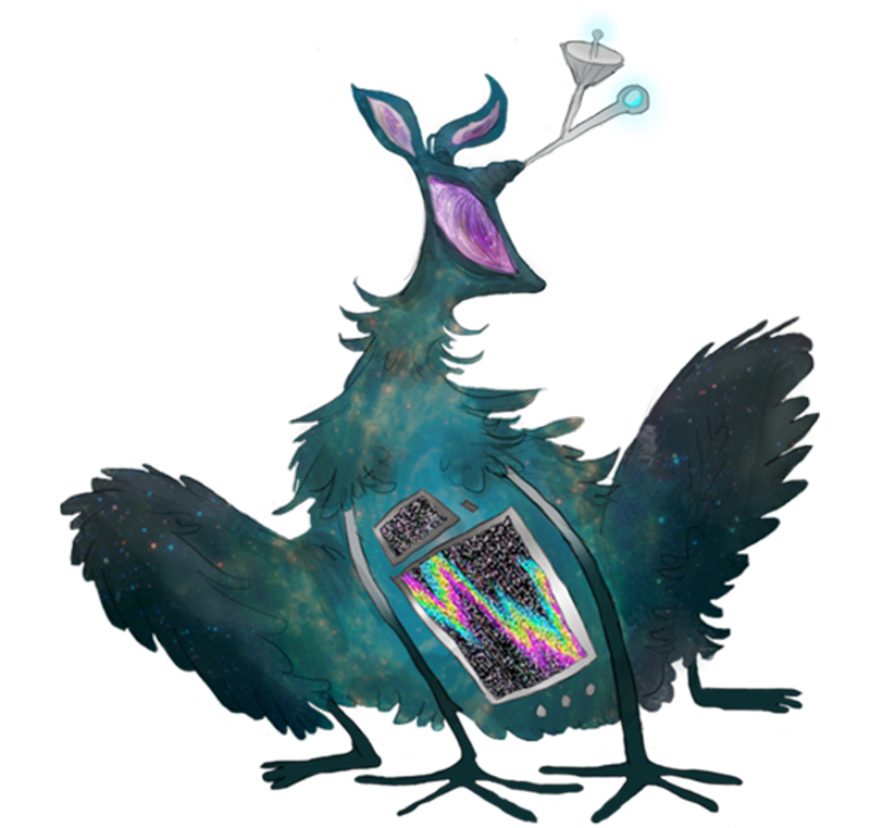
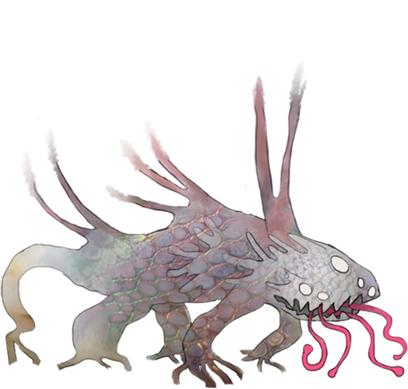
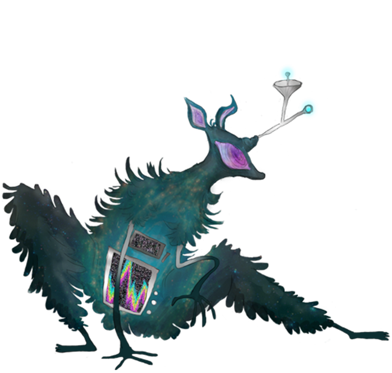
To best convey the diversity of our cohorts, Emily and I decided to combine character artwork from the Animation students into our web design. We asked a few of the animation students to create various cryptids in their style. In turn, this allowed Emily and me to highlight the diversity of our cohorts through stylistic variety.
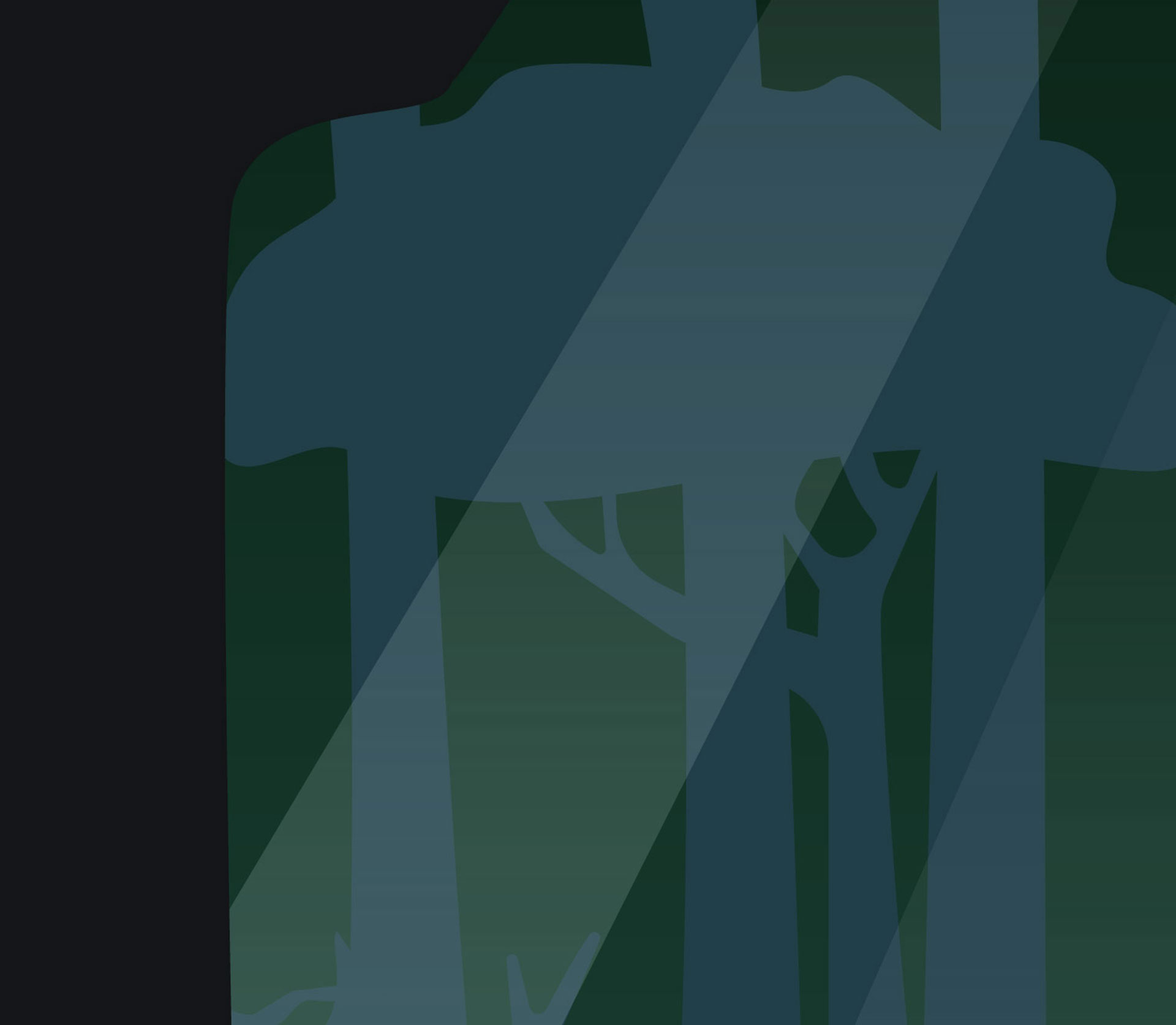
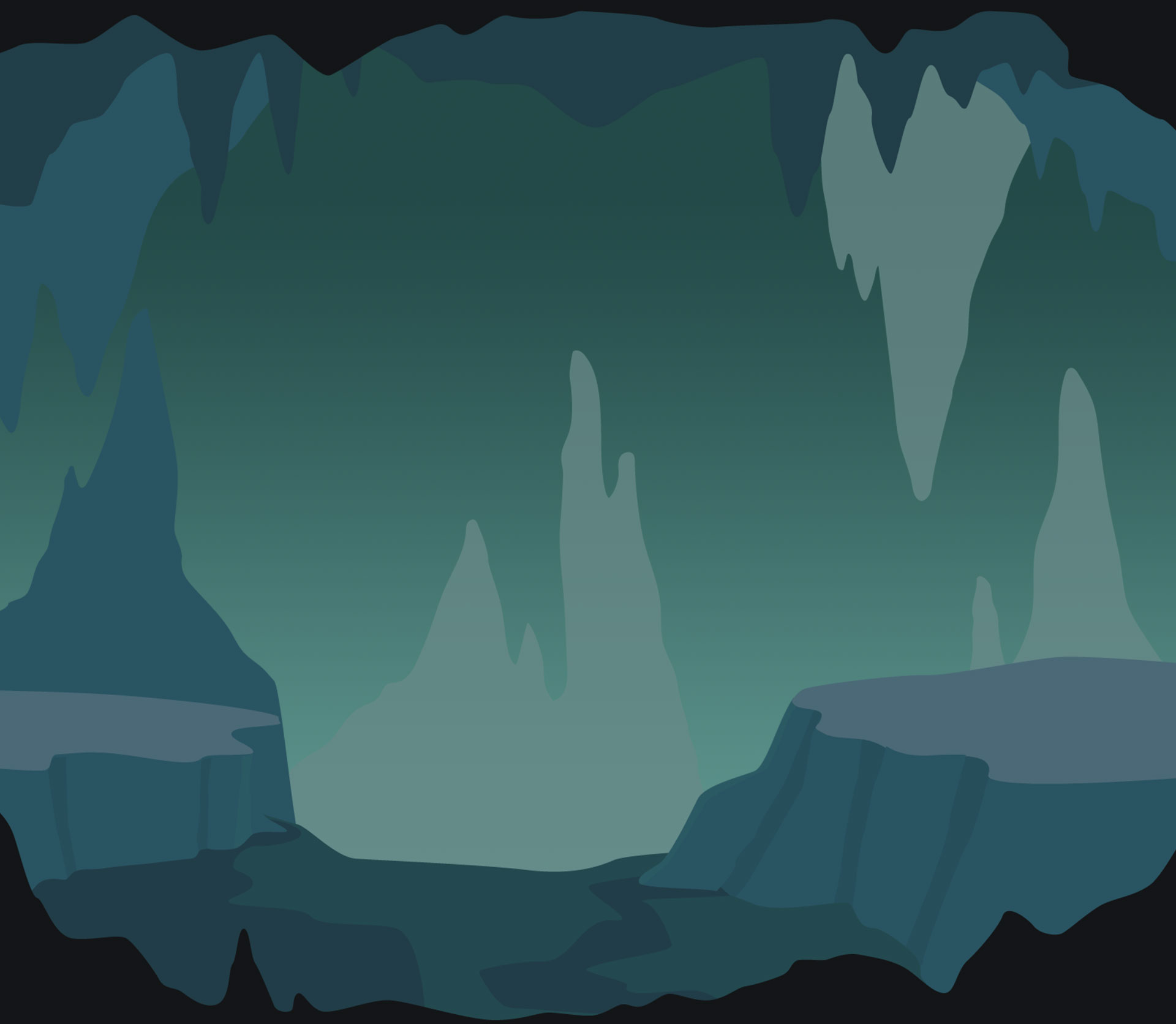
A few of the Interface Design students—who are also skilled at illustration—created the background to accompany the characters. In contrast to the varying styles of the characters, the background graphics have the same hue and design.
Sky Characters
Forest Characters
Cave Characters
backgrounds
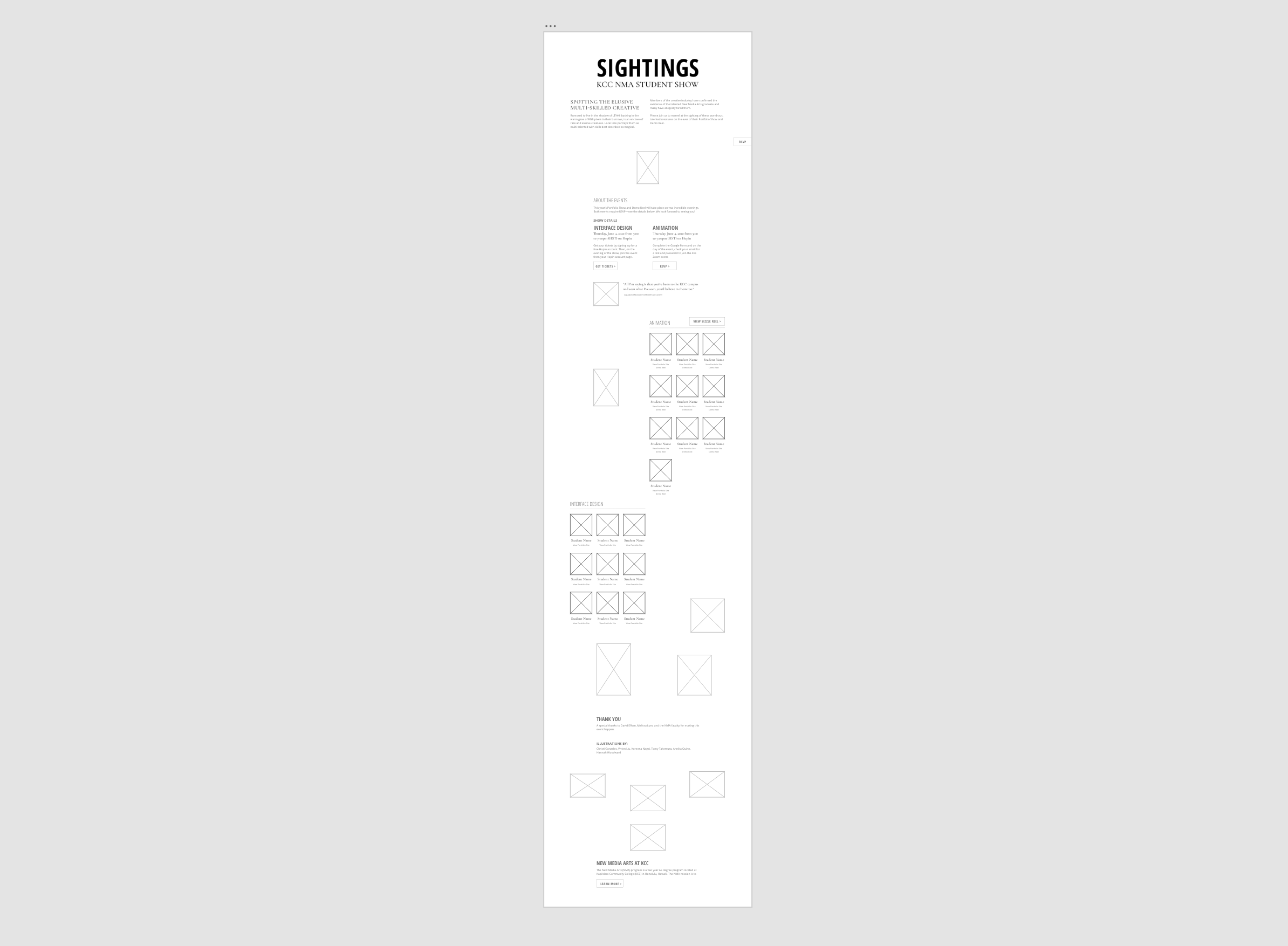
Wireframe
Emily and I decided to make the student website a single-page site to consolidate all of the information without subpages. This left us room to explore different layouts and text hierarchy.
The student portion of the site—used to show our portraits that link to our works—was the most challenging due to the various design features that are available. We originally thought that a filtering button would be ideal as the user could toggle between all of the students and both cohorts. The length of the website would also adjust to the height of the student section. However, we reconsidered this design as it involved unnecessary steps to view specific students’ works in their respective cohorts.
As we redesigned the student section, we kept usability in mind from the perspective of professionals and potential employers. Since we are catering to professionals in both the Animation and Interface Design fields, we decided to divide the cohorts according to their respective concentrations, which allowed ease of viewing.
final Design
user interface design









social media
Instagram
facebook
credits
Vivien Liu and Hannah Woodward