
2021 Pele Awards—Bronze Medal—Packaging
Brand Design
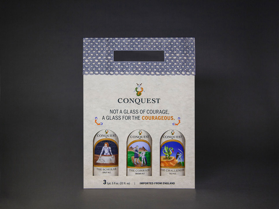
Conquest
Conquest is a fictitious brand of ales that prides itself on its historical reverence
This brand of medieval ales celebrates the courage of warriors—past and present—and rejoices in their accomplishments.
- Brand Strategy
- Illustration
- Copywriting
- Mockup Production
- Package Design
- Layout
- Motion Graphics
- Style Guide
Breathe life into a brand of old, artisen ales
Create a coherent and unique relatable brand strategy and identity that captures the essence of the rich history of Conquest’s line of English ales to young professional aged 25–35.
Design the new face of courage
In the targeted age range, many individuals strive to define themselves as they lay the foundation for their future. Conquest was built upon the drive to empower and reward those who strive to lead a fulfilling life with tenacity and courage. To achieve this objective, the deliverables consist of medieval imagery paired with a bold, sans serif type and copywriting.
Social Media Advertisement, Music: "Evolution" by: Benjamin Tissot, Bensound.com
 Front of bottles
 Back of bottles
Brand Strategy
core attributes
- Courageous
- Midieval
- Tenacious
- Reverent
- Mature
Positioning Statement
Conquest prides itself on its historical reverence as we resurrect the techniques and craftsmanship of medieval dark ale. Our malts–harvested from the English countryside–rest above the eternal flames of an ancient dragon-fight for a smooth, roasted finish.Audience
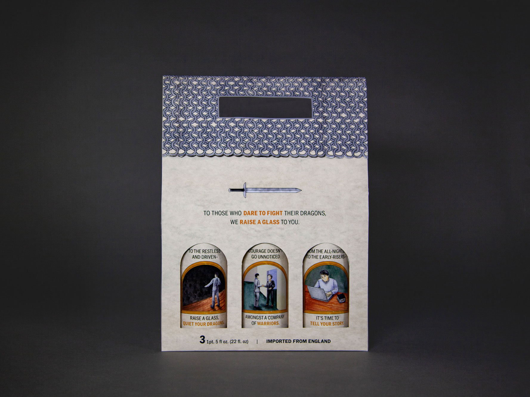
Our audience consists of mature yet tenacious young professionals ranging from 25–35 with middle-range incomes. We reward those along their quest to push past their comfort-zone—whether they’re a graduate on the cusp of professionalism or asking for a raise. To those who have the courage to fight their own dragons, we raise a glass to you.
Brand Personality
We are armed with passion as we pay reverence to the craftsmanship that has been fostered during the middle ages. Our verbiage reflects the balance between tenacity and empowerment to enliven our customer’s spirits, while emboldening them and ourselves to be fiercely authentic.
Copywriting
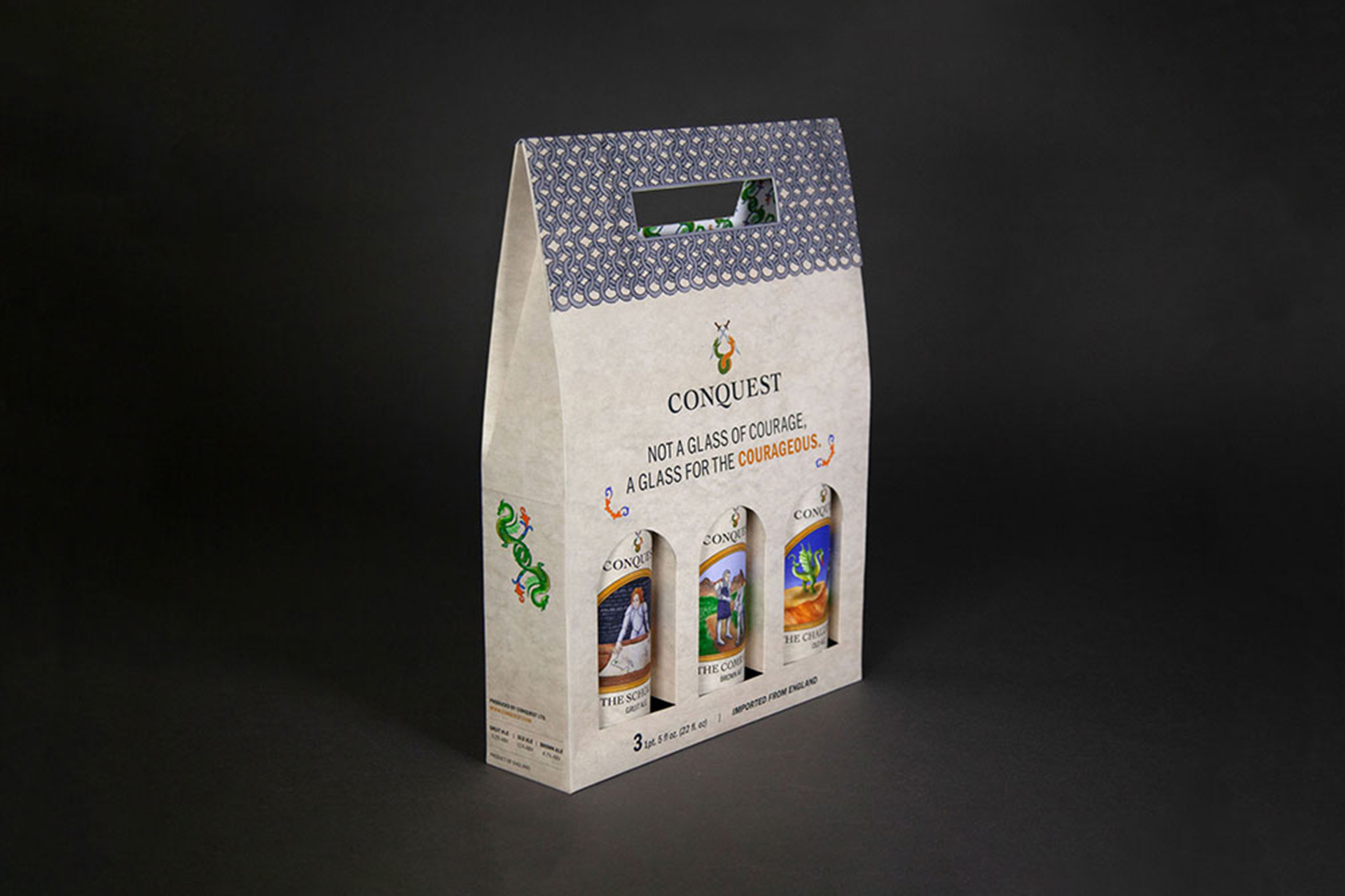
not a glass of courage, a glass for the courageous.
-
To those who have the courage to fight their own dragons, we raise a glass to you.
-
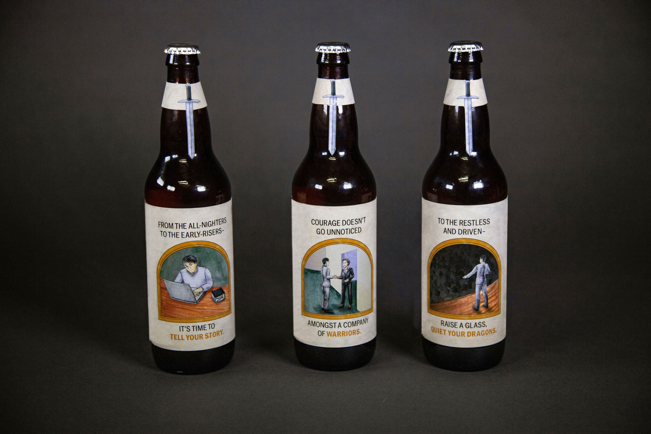
From the all-nighters to the early-risers—we raise a glass to you.
-
courage doesn't go unnoticed amongst a company of warriors.
-
to the restless and the driven—raise a glass, quiet your dragons.
-
Grab a drink and share your story. It's your turn to inspire others.
Design System
Typographic Scale
This is my h1
This is my h2
This is my h3
I used Franklin-Gothic-URW-Cond for my headers and Franklin Gothic URW for my bodycopy. I selectively used orange in my headers to emphasize certain words.
Color Study

logo Design
Finalized Design
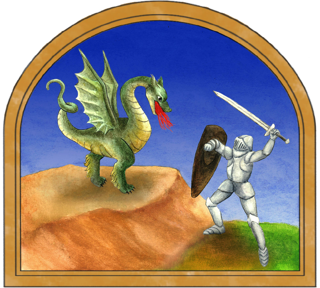
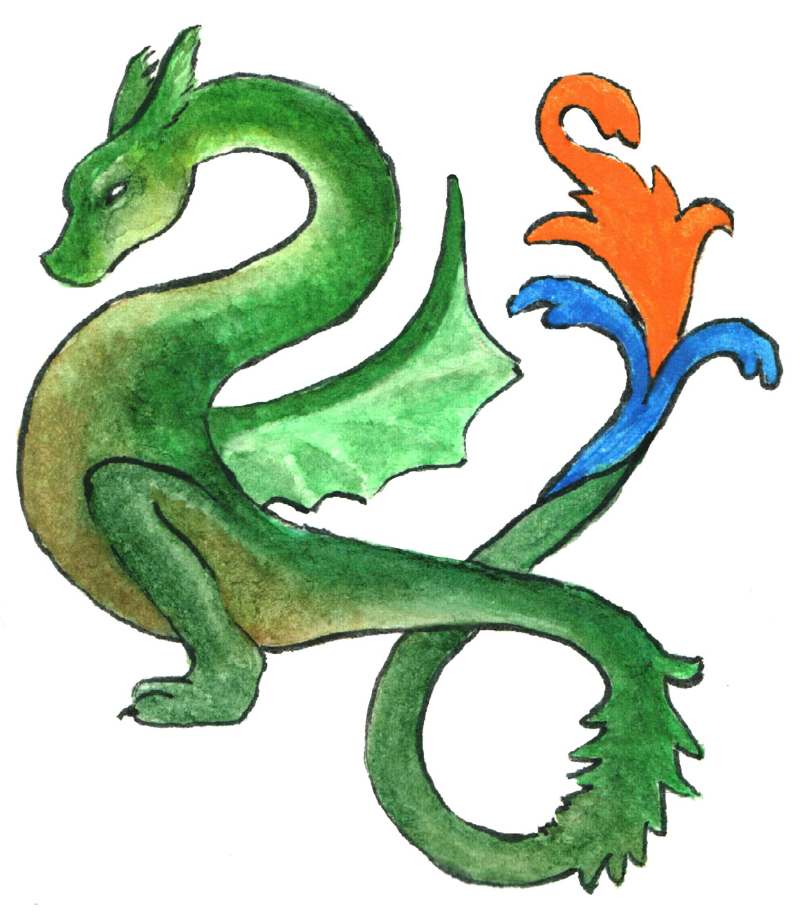
This logo demonstrates the tenacity of our brand when one slays the different dragons that one faces. The earthy colors for the dragons were chosen due to the likeness of their portrayal in illuminated manuscripts.
Logo exploration
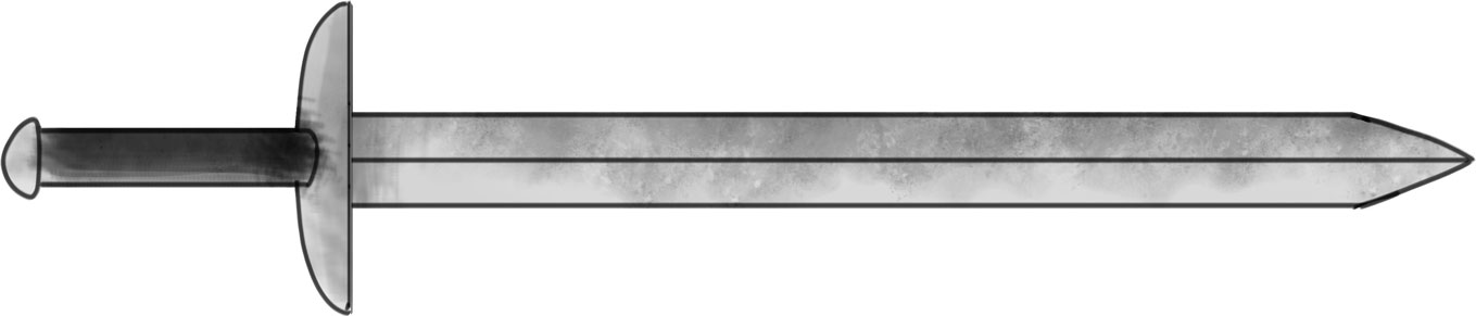
Artwork
Illustrations
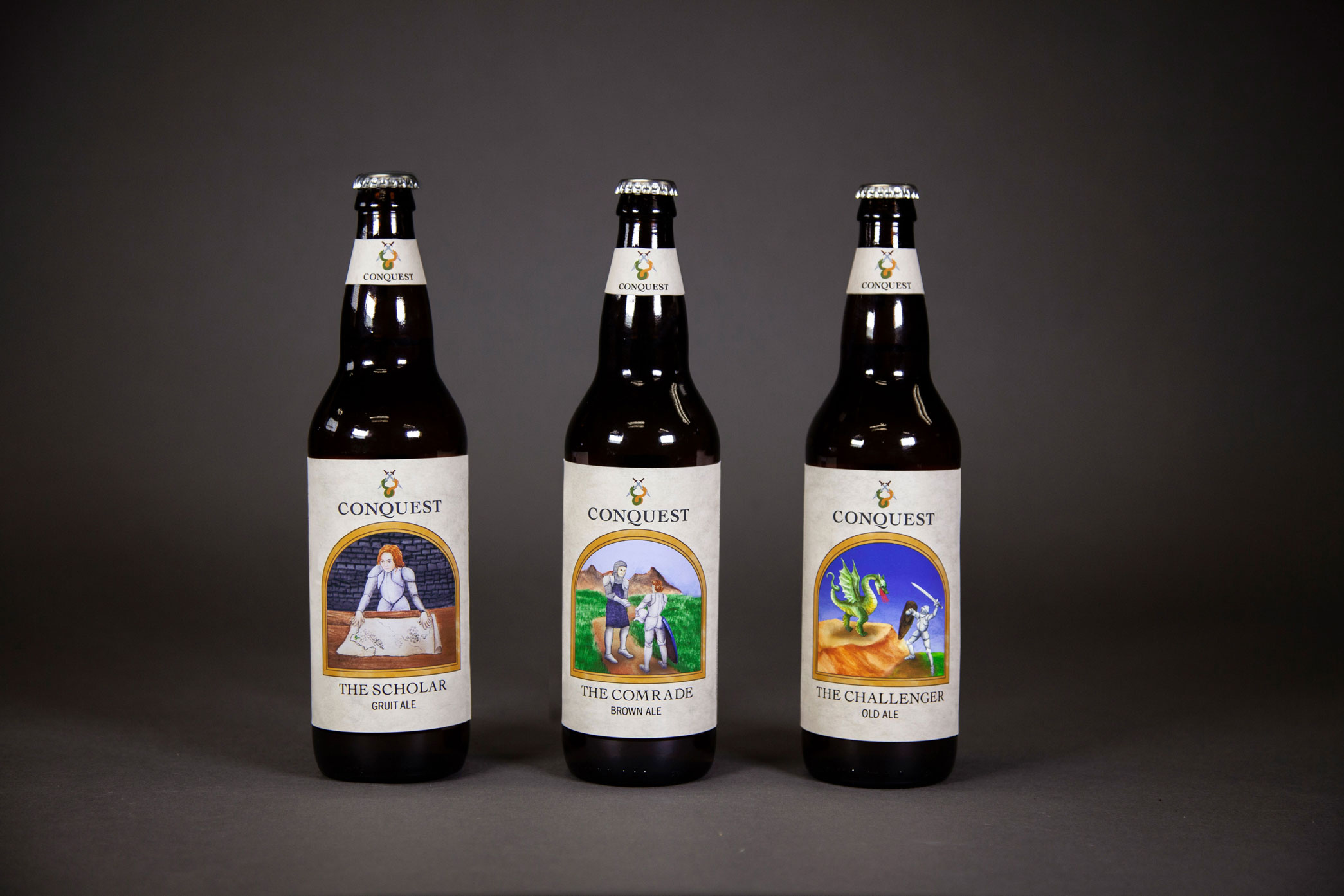
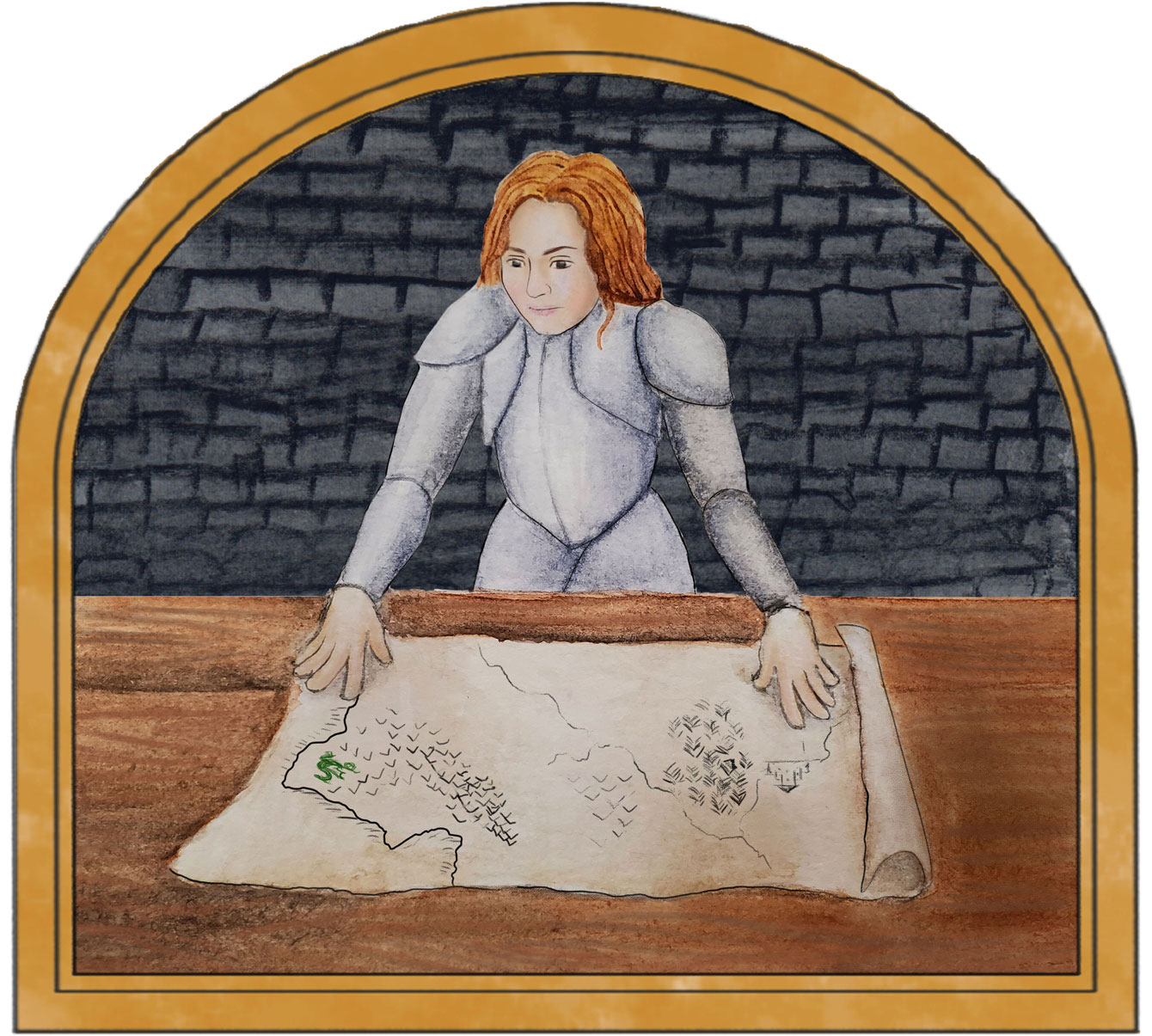
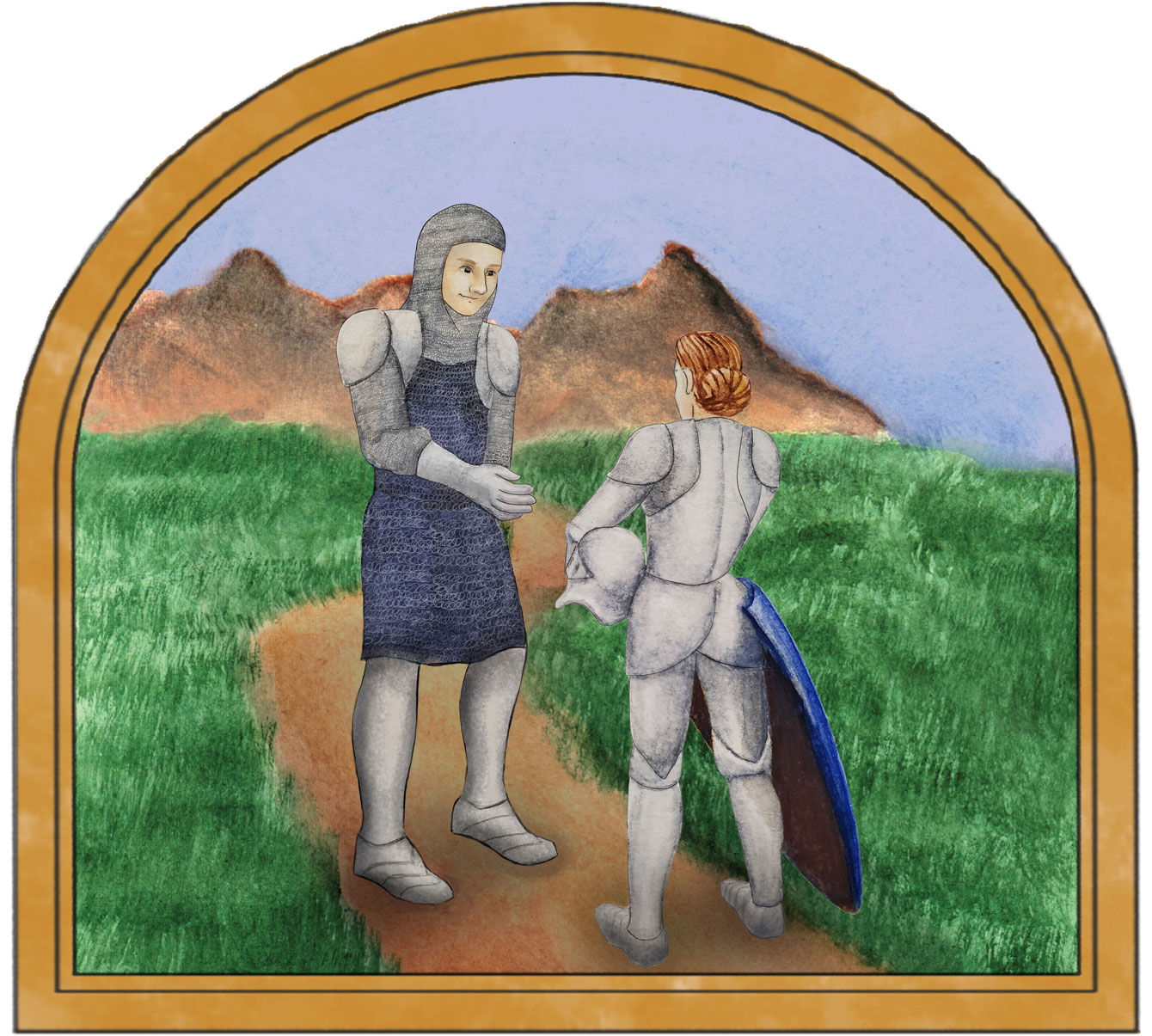
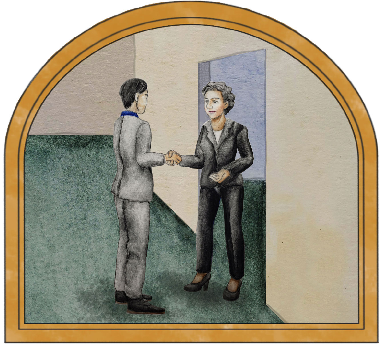
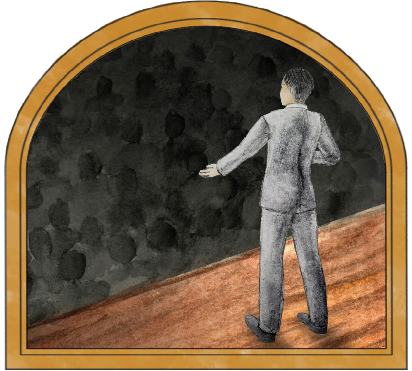
In contrast to the modern typeface, the hand-painted imagery is inspired by illuminated manuscripts from England to ground the brand in its medieval roots. The illustrations envision courageous acts to inspire tenacity and courage from its beginnings to modern times.
Art for bottle packaging


Patterns
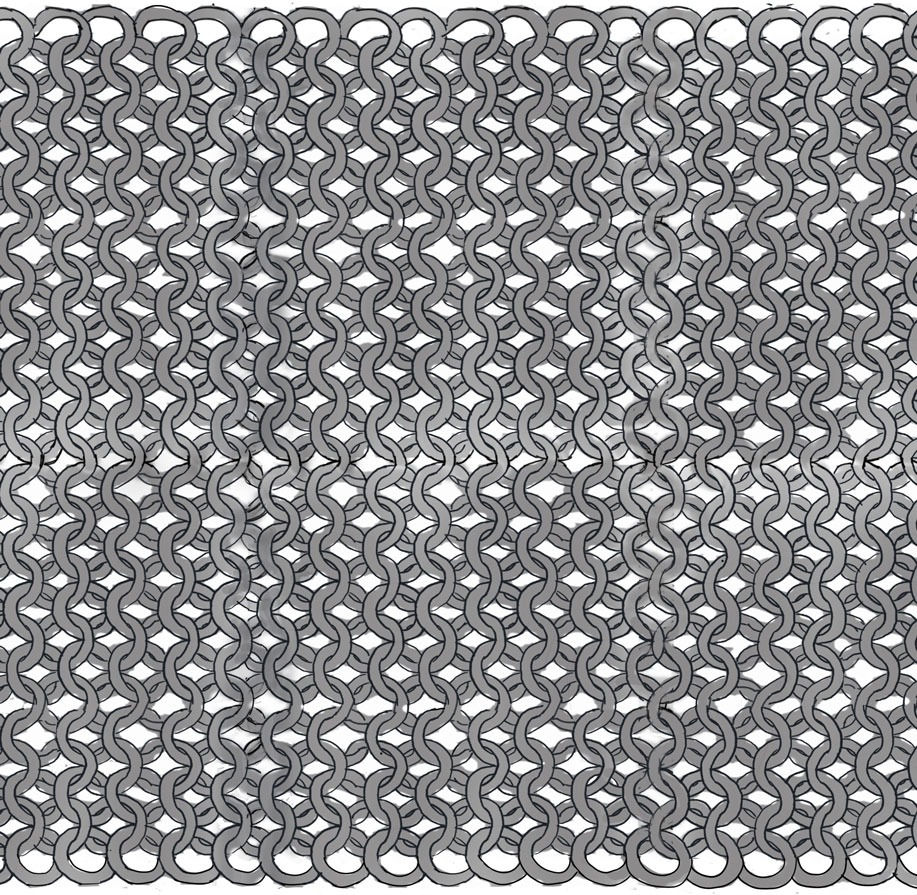

style guide
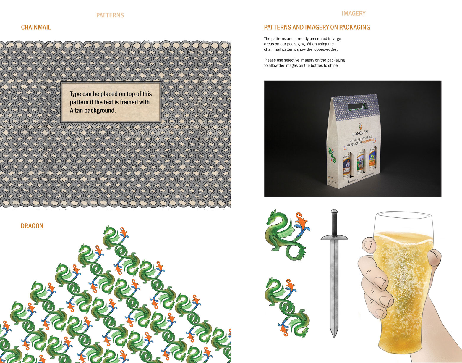
Conquest is a brand that aims to kindle the tenacious spirit in future generations. To uphold its legacy, I created a style guide.
View PDFFinal Designs
 Front of
packaging
Front of
packaging
 Back of
packaging
Front
of bottle
Back
of bottle
Back of
packaging
Front
of bottle
Back
of bottle